Both the name and logo changes of Disneyland Resort Paris are well-documented, but there’s been something going on these past couple of years which has begun to make all that fuss about switching from “Euro Disney” to “Disneyland Paris” very simple indeed.
History in logos…
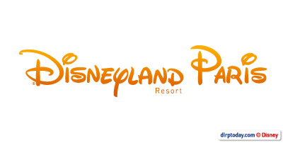
With the 2002 opening of the second Disney park in Paris, we were introduced to Disneyland Resort Paris and the “arc and stars” of a brand new logo which is still frequently used to this day:
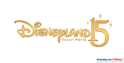
However, to celebrate the resort’s 15th anniversary in 2007, you’ll remember a special new logo was introduced — and went on to become very widely-used. It dropped the arc in favour of a dramatic “15”, and simplified — though probably shrunk a little too much — the “Resort Paris” element:
Now, as popular as this logo apparently was, both with fans and the resort’s advertising teams, it obviously posed a problem for advertising in UK. Unlike the other countries where Disneyland Resort Paris holds offices, the UK promotes both Walt Disney World in Florida and Disneyland in Paris entirely equally. Since 2002, the “Paris” of the resort’s logos just wasn’t clear enough.
So, last year in 2008, we got a solution:
Not technically a resort logo — it has only really been used in UK advertising, and never at the resort itself — it was hardly perfect. The “Resort” only just managing to cling on and certainly, a strong example of why The Walt Disney Company should probably refrain from using its cherished typeface for anything other than the key words themselves — the “P” of “Paris” appearing more like the classic “D” being waved around on a stick.
New 2009 logo
Which brings us neatly up to 2009. Another year, another logo? Yes indeed!
However, this time, they took the chance to fix things once and for all — well, eventually. The first simplified logo for the Mickey’s Magical Party year stayed close to its “Disneyland15” predecessor, but now a new, updated version appears to have finally clicked “bold” on the “Resort Paris” and no doubt put a smile on the UK office’s faces:
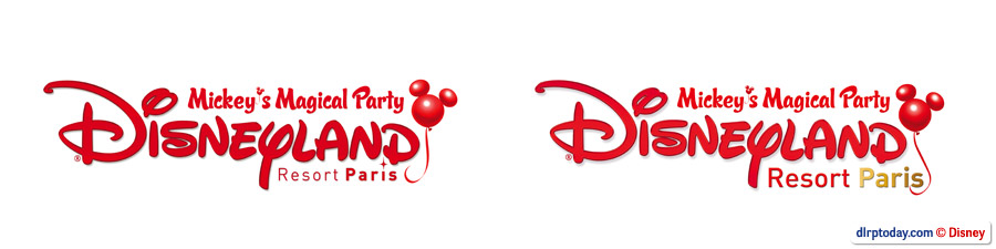
First version / Second version
Even better, perhaps, there’s a version of the logo without the “Mickey’s Magical Party” title but still very nicely framed by the new balloon emblem:
But, come 2010, will the balloon (or even the logo!) remain? Quite possibly…
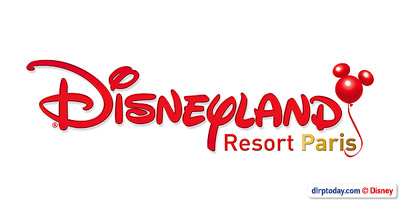
A generic version of the logo removes the balloon and brings the text almost right back to the resort’s classic navy blue colour used for the 1995 “Disneyland Paris” logo:
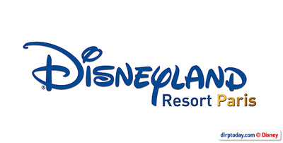
Without the balloon, it’s admittedly not quite as special, but what do you think? Is the new logo an improvement? And should it — or will it, even — stay beyond 2009?
All logos © Disney.