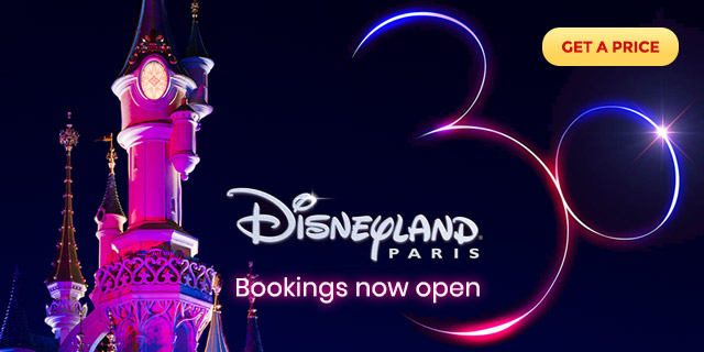

A 20/20/20 vision: The official logos for the 20th Anniversary are here! Who cares there’s eleven months still to wait and that so far we only know one addition. Tinker Bell couldn’t wait any longer to prove that, when she’s not churning out direct-to-home video movies, there’s nothing she likes better than to jazz up a few anniversary logos with some pixie dust sparkle. This trio of three differently-formatted logos are the first pieces of the resort’s promotional materials for the big events of 2012 to be released, revealing a shiny, pretty, colourful logo that looks, well, exactly as you’d expect. Glossy lettering? Check! Pink castle? Check! Tinker Bell? Check! It looks a definite step up from the 15th Anniversary logo, however, with a much bolder and more modern design style that includes a nice multi-coloured pixie dust trail from Tink (reminiscent of Tokyo’s 25th designs)and giant sans-serif numbers. Even the Castle looks perfectly pretty, with no humiliating Mickey Mouse symbols plastered over its windows, something that had become worryingly trendy over recent years.


One of the secondary logos simply features the Disneyland Paris logo with “20” to one side, similar to the classy alternative 15th Anniversary logo which became increasingly popular through that event. The semi-circular design of the main logo, meanwhile, looks like practically every Disneyland Paris logo of the late ’90s. It’s hard to know whether the recurring themes of the castle, Tinker Bell, fireworks, pixie dust and circular shapes show a lack of a imagination or a fun nod to the past. At least this time, the Peter Pan reference might tie into an actual anniversary event.

What do you think? Let’s have scores out of 20!